Fredelios

The trials and tribulations of an aspiring 3d-artist

Meet Mr. Goblin Green

Being a fantastical creature working as a desk clerk, it is quite fortunate how little he is judged for actually being a goblin. However it is equally unfortunate how much he is judged by his attitude, smell and a general sense of awkwardness that comes with being stuck in a dead-end job with no chance of promotion, social life nor happiness.

The world itself being corporate and uncaring in equal measure, it is not so different from our own, with the only real anomaly being our little green associate.

Materialism is God and wealth is to show how devoted you have been, the corporatocracy is here to stay.

The style is deemed to be set as realistic while ever so slightly skirting into the territory of the more detailed cartoony style.

Being thought of as a darkly humoured Beat’em Up, the main competitors are deemed to be Double Dragon Neo, Guacamelee and Scott Pilgrim vs The World: The Game.

All in I reckoned it was an interesting concept from the start, but in the end it was the Nekrogoblikon song and its accompanying video that truly sold me the idea. (https://www.youtube.com/watch?v=KsMKOx6fumc)

The main things I needed to know to properly complete the assigment was, and still is the location of my laptop charger. Although more software knowledge is always welcome in all fields.

Possible risks were; running out of electricity, somehow screwing up the model because of my unfamiliarity with 3dsmax and letting my familiarity with other lesser software lead me to make decisions that simply should not be done in “max”.

Addressing those concerns were as thus, getting as much of the software I could legally get to my stationary computer, begging, borrowing and stealing electricity from my colleagues, familiarising myself with 3dsmax by forcing myself to use it and it alone for side projects, once I actually have enough to get back to working on said side projects again and finally solemnly swearing that I should never, ever again attempt to triangulate anything in max, to trust in the strange and weird utility called “edge loops”, and forget everything I’ve learned from working with my old programs so that I may be cleansed from my past and rise from the ashes as the immortal phoenix itself.

The motivations behind the style chosen is because of time constraints, it was deemed too risky to take too long working out a new one, that and the existing concept art really spoke to me, feeling it would be a waste not to follow it as best as I could.

In the end, the final mesh still have ways to go, and likewise with the texture with plenty of minor and not so minor issues remaining to be fixed.

The silhouette, while being given ample aid from the textures is still much too clunky in spite of its high poly count, the face, hands and feet in particular needing much more attention, while the back and chest still not interesting enough to warrant as many polies as it has received.

ScreenShot00003

ScreenShot00000 ScreenShot00001

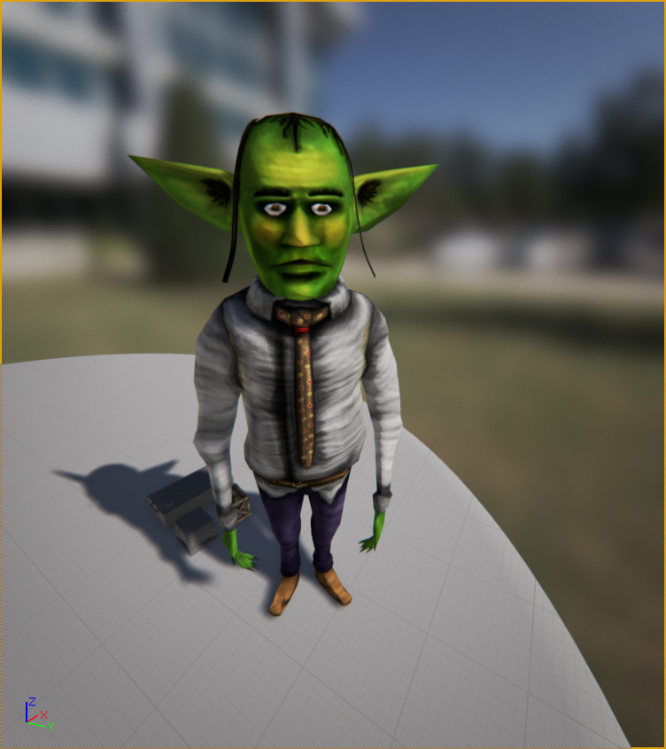
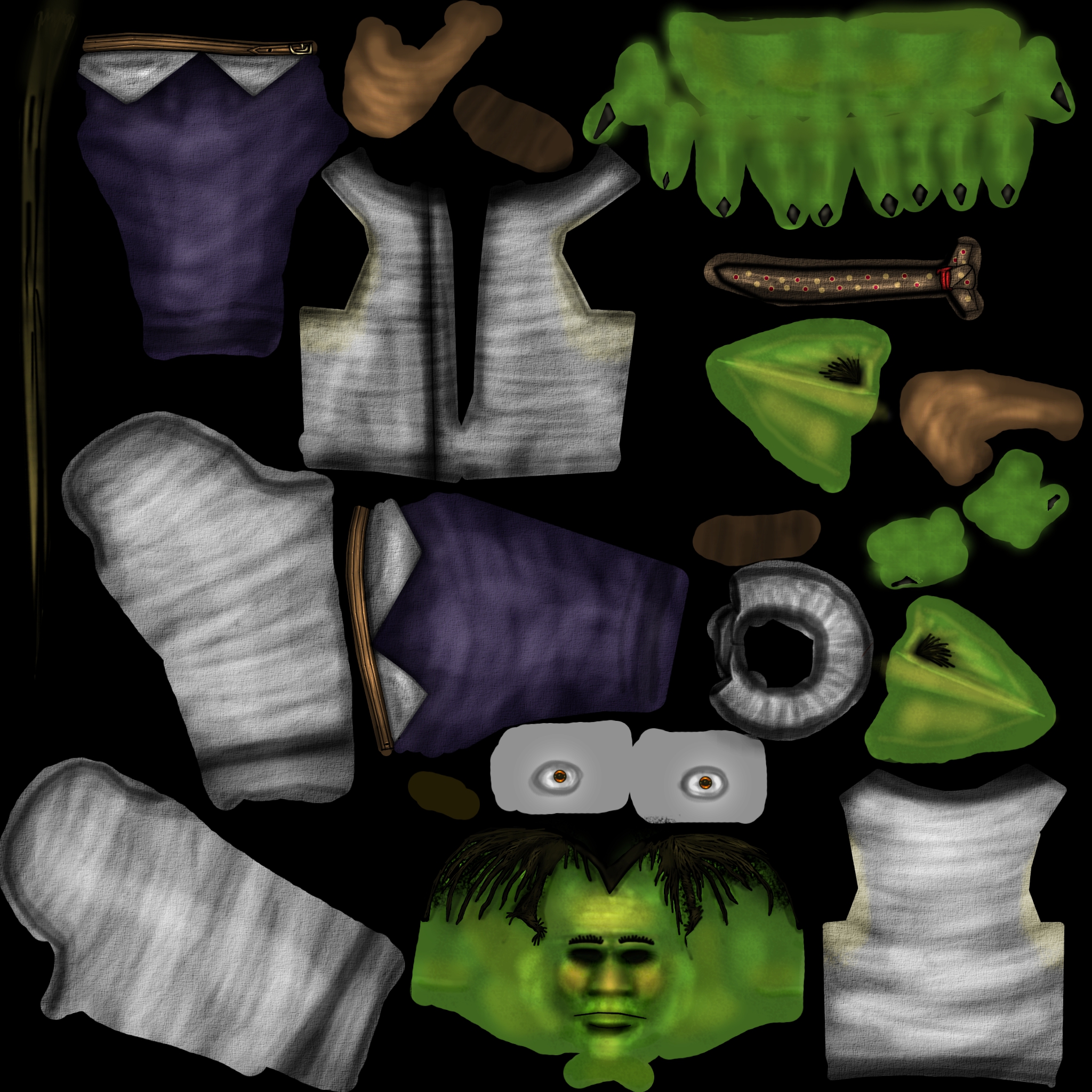
As for the diffuse, one can at once see how disastrous and sloppy the uv-mapping was, and while a more confident person would claim to be not entirely unsatisfied with how the cloth texture ended up, it still is lacking in shadows and more pronounced folds and wrinkles that could be used to further accentuate the body, making up for the still-lacking silhouette in the process.

The yellow highlights on the skin was more of an after-thought and while they enhance the green through the power of analogous colours, they could have used more work on the actual texture on the skin as currently they are too flat in comparison.


assignment3_goblin_D

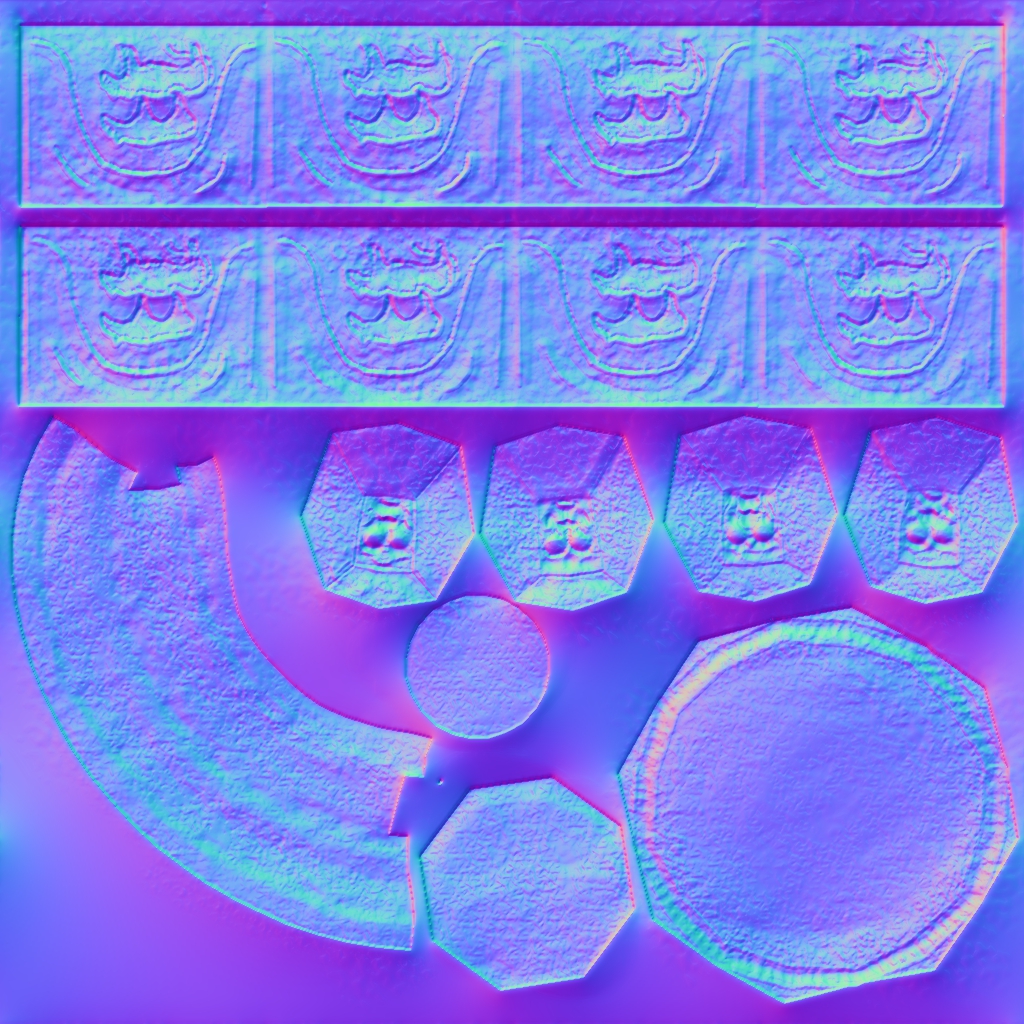
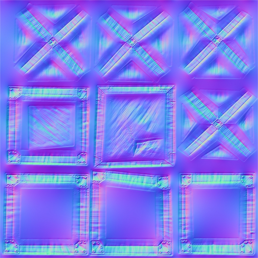
As for the normal, it serves as an epitaph to Crazy Bump, hallowed be its name, missed forever it will be.

While the folds are emphasised, some things that could’ve used some post-process work are quite visible, such as the eyes and the tie that really could have used some smoothing up as their patterns most certainly shouldn’t be bumped like this.


assignment3_goblin_N

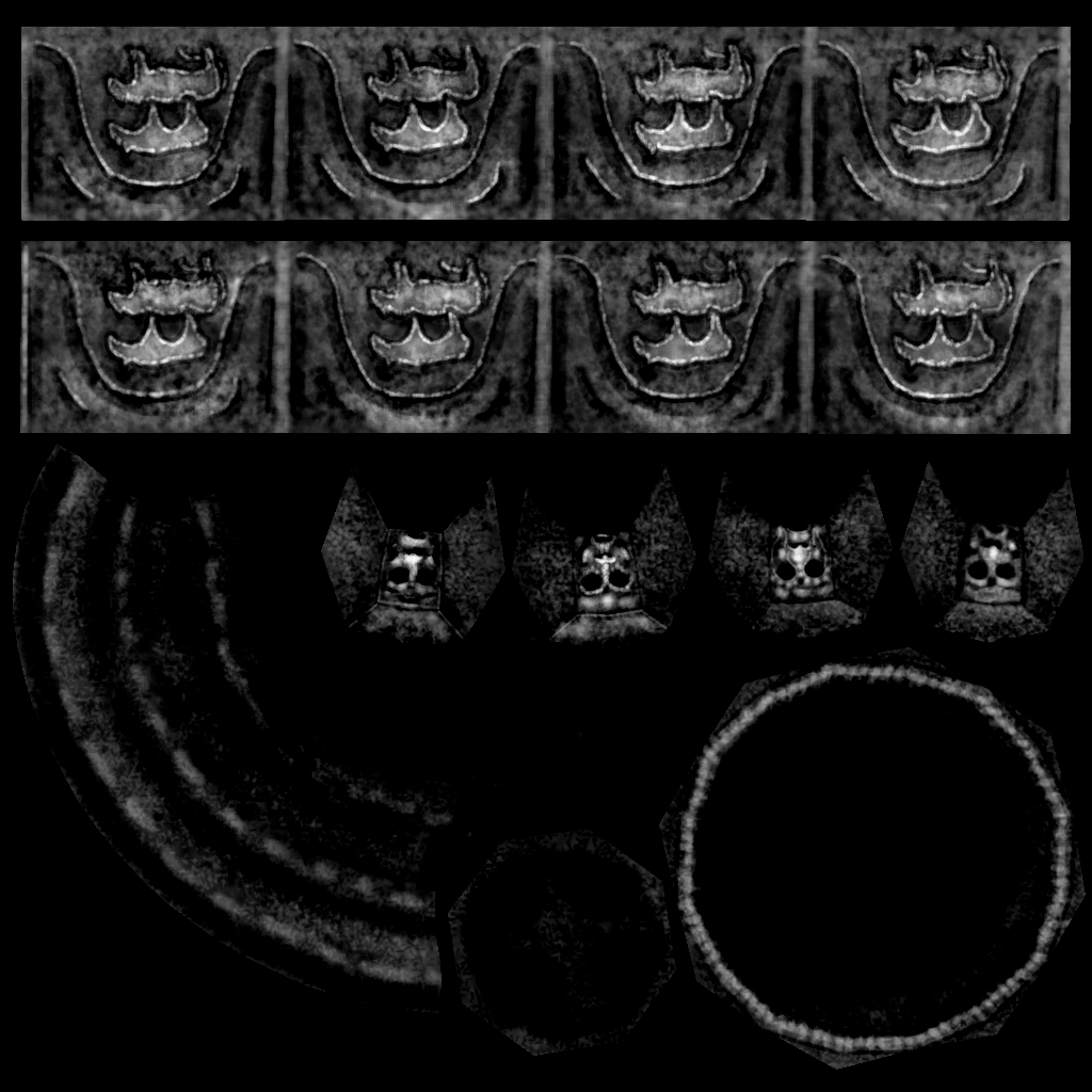
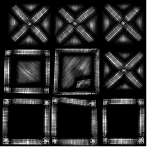
And finally the specular map is a bit too faint to really make a difference, and while it is felt that focusing on the eyes was the right thing to do, surely the trousers, belt and skin also could’ve benefited from a lighter specular.


assignment3_goblin_S

The font that God forgot

A highly incomplete piece, this rendition of a baptismal font has yet to see better days, but someday it hopefully will.

The thoughts of the style are definitively meant to be angle towards Skyrim more than Asterix and Obelix, even if the simpleness of the mesh and texture tell another tale, although there is still a considerable journey left to undertake before it achieves that lofty goal. Speaking of lofty goals, the motivations behind the attempt of making it in that style is primarily fuelled by the secret desire to one day on a game such as the much-praised Bethesda-made rpg (although with an artstyle and historical focus more in the direction of Deliverance: Kingdom Come, but that’s splitting hairs.)

The scheme is once again the favoured monochromatic one, partly because of the referenced piece itself, but mostly because of the unease of rocking the metaphorical boat by being too adventurous in a time crammed to the brim with deadlines, minor illnesses and technical obstructions.

The main colour is yellow, with brown and almost the hint of a slightly not-at-all-green-but-still-somehow-giving-the-impression-of-something-nearing-green-ish hue. Although that may be because I’ve been staring at its picture for too long. At any rate, it was chosen because yellow in stone is what this one associate with the things of yore, incredibly broad sweep that it may be. It is also good for catching the eye and it in this humble opinion gives off the feeling of brimming with the weight of history, plus it works great with the dodge tool when making highlights.

While mostly saturated, with plenty of highlights, the shadows are given more hue to further denote the differences betwixt the dark and the light, with the carvings and other details brightened, or rather bleached, to make them properly stand out.

One can say that the colours are definitively wading in the warmer pool as opposed to the coldness one would normally associate with stone.

ScreenShot00002

The uv, being horribly rushed and quite unfortunately turned upside down certainly made a stressed mind ever so slightly more stressed, and while intentions were good and ambitions high, the notions of 8 unique carved images and 4 equally unique faces were swiftly turned to dust as time came crashing down.

As such, the diffuse suffered because of it, just as the silhouette of the mesh itself remained low in detail and poor of execution.


assignment2_baptismalfont_D

As for the normal map, it once again proved how brilliant Crazy Bump is, especially compared to the bump mapping plug in for gimp that one has been stuck with using in the past.

The main job of the normal being to accentuate the carvings and the coarseness of the surface texture, being the veritable cavalry that comes in the diffuse’s time of need, while not necessary saving the day but at least giving it a fighting chance, one last blaze of glory one could say.


assignment2_baptismalfont_N

Meanwhile the specular is there for one thing and one thing alone, aiding the normal. Doing its work by accentuating the carvings and the edges while giving but the slightest of glints to the recesses of the stone.


assignment2_baptismalfont_S


The little crate that wouldn’t open

Keyboards make really bad pillows, but this is neither the time nor the place to lament about such things, instead it is time to finally start being properly reflective.

The style attempted for this piece was that of realistic post-apocalyptic, partly because the opportunity to make something completely in metal felt interesting to attempt it but also because the chances for making something battered, deformed, full of scratches and rust would be a good experience.

The colour scheme was safely influenced by most post-apocalyptic world-of-brown-worlds, as a highly monochromatic choice of brown with splashes of lighter brown and some more brown as well as hints of orange, red for the much-loved dominance harmony brought by using analogous colours.

With that said, it is equally safe to say that the dominant colour is indeed brown, the main reason being cowardice and the too-highly regarded notion of “playing it safe”. That and the fact that it is a highly established choice of dominant colour in these types of worlds.

While lacking the proper amount of thought behind itself, the colours can express the notion of the metaphorical destruction after pride, the bleak yearning after a past that is no more and the re-assertion of the earth itself as it tries to reclaim what was once taken from it.

Saturation was the watchword of the day the texture was made, with everything from the metal to shades of rust, saturation is very much the main thing utilised.

Even with the bleak melancholy of the piece, being derived from red and yellow one is highly tempted to say that the colours are warm. In the end the end one would say that the colours are warmer than they are cool, possibly venturing into the area of neutral warm, although that is mostly if not fully influenced by the lingering thoughts of the piece rather than the visual feedback and it should in fact be properly considered as fully warm.

ScreenShot00001

As for the maps themselves, the diffuse does most of the work, getting most if not almost all of the attention such as the scratches in the metal, the rust and the details, simply put the diffuse is the star of the show with the normal and specular being there simply to make it shine (figuratively and literally).


In the end, that is the true goal however they are most decidedly capable of much more than just conforming to the whims of the diffuse. Working with he normal and specular together they could very likely have created some much more believable scratches that the diffuse could merely had hinted at, and with more variation on the specular to further denote where the rust has attacked the hardest could only have improved the piece further. In the end, what should be thought is “how can I enhance the mesh in ways the other maps couldn’t”, in this humble person’s humble opinion.

The specular in particular are important in without at least the minuscule of sheens, even things that style themselves the epitome of matte-ness would suffer from it, it breathes a hint of life into it, a breath that even that which has no life sometimes need.

assignment1_crate1_D

assignment1_crate1_N


assignment1_crate1_S