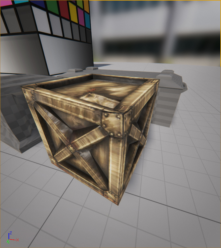
The little crate that wouldn’t open
by fredelios
Keyboards make really bad pillows, but this is neither the time nor the place to lament about such things, instead it is time to finally start being properly reflective.
The style attempted for this piece was that of realistic post-apocalyptic, partly because the opportunity to make something completely in metal felt interesting to attempt it but also because the chances for making something battered, deformed, full of scratches and rust would be a good experience.
The colour scheme was safely influenced by most post-apocalyptic world-of-brown-worlds, as a highly monochromatic choice of brown with splashes of lighter brown and some more brown as well as hints of orange, red for the much-loved dominance harmony brought by using analogous colours.
With that said, it is equally safe to say that the dominant colour is indeed brown, the main reason being cowardice and the too-highly regarded notion of “playing it safe”. That and the fact that it is a highly established choice of dominant colour in these types of worlds.
While lacking the proper amount of thought behind itself, the colours can express the notion of the metaphorical destruction after pride, the bleak yearning after a past that is no more and the re-assertion of the earth itself as it tries to reclaim what was once taken from it.
Saturation was the watchword of the day the texture was made, with everything from the metal to shades of rust, saturation is very much the main thing utilised.
Even with the bleak melancholy of the piece, being derived from red and yellow one is highly tempted to say that the colours are warm. In the end the end one would say that the colours are warmer than they are cool, possibly venturing into the area of neutral warm, although that is mostly if not fully influenced by the lingering thoughts of the piece rather than the visual feedback and it should in fact be properly considered as fully warm.
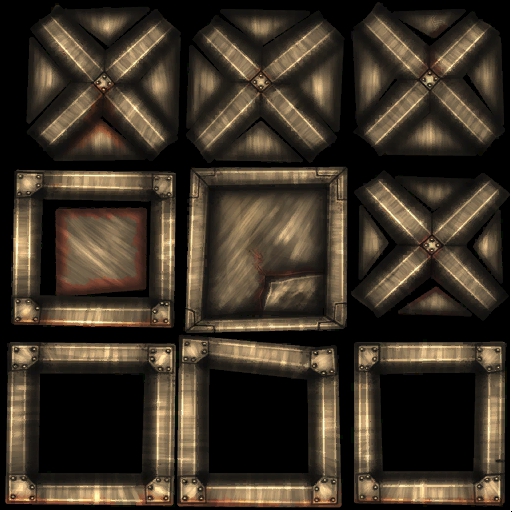
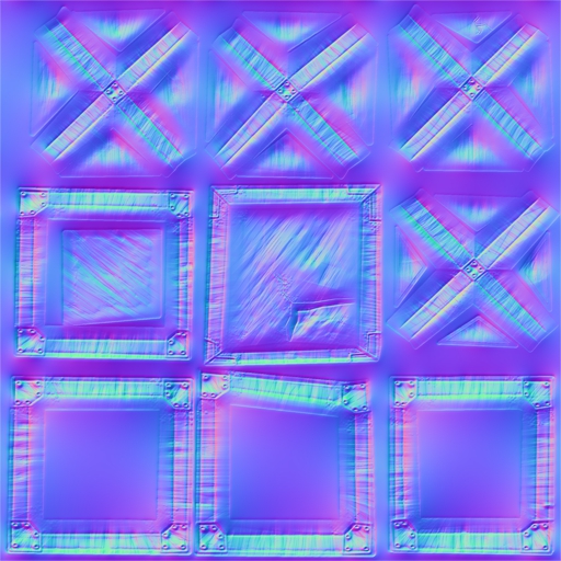
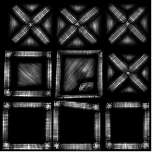
As for the maps themselves, the diffuse does most of the work, getting most if not almost all of the attention such as the scratches in the metal, the rust and the details, simply put the diffuse is the star of the show with the normal and specular being there simply to make it shine (figuratively and literally).
In the end, that is the true goal however they are most decidedly capable of much more than just conforming to the whims of the diffuse. Working with he normal and specular together they could very likely have created some much more believable scratches that the diffuse could merely had hinted at, and with more variation on the specular to further denote where the rust has attacked the hardest could only have improved the piece further. In the end, what should be thought is “how can I enhance the mesh in ways the other maps couldn’t”, in this humble person’s humble opinion.
The specular in particular are important in without at least the minuscule of sheens, even things that style themselves the epitome of matte-ness would suffer from it, it breathes a hint of life into it, a breath that even that which has no life sometimes need.